
How to Use
Use the palette chooser to create a series of colors that are visually equidistant. This is
useful for many data visualizations, like pie charts, grouped bar charts, and maps.
Note: there are two other modes besides palette mode – check out single-hue
scales and divergent scales as well.
Creating visually equidistant palettes is basically impossible to do by hand, yet hugely
important for data visualizations. Why? When colors are not visually
equidistant, it’s harder to (a) tell them apart in the chart, and (b) compare the chart to the key.
I’m sure we’ve all looked at charts where you can hardly use the key since the data colors are so
similar.
For instance, Google Analytics does a terrible job with this:
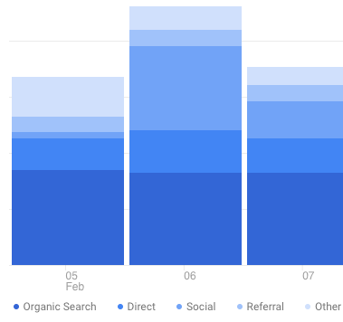
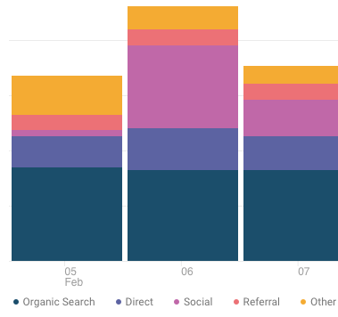
It’s better to use use a range of hues so users can cross-reference with the key
easier. It’s far simpler for our brains to distinguish, say, yellow from orange than
blue from blue-but-15%-lighter.
This color picker allows you to specify both endpoints of the palette. You can choose at least one to
be a brand color, which gives you significant flexibility in creating a palette that will work for
your visualizations, yet be customized for your brand.
Here are a few tips for getting the best palette:
- Try picking very different endpoint colors – e.g. one warm, one cool; one
bright, one darker – so that your palette covers a wider range - If you’re using a brand color for one endpoint, don’t be afraid to
modify the saturation
and brightness a bit if it creates a more pleasing palette. Users will
recognize your brand color by its hue much far more than by it’s exact
saturation/brightness. - For data visualizations where you’re showing the strength of a single value,
try using the Single Hue Palette Generator instead.
Oh, and…
More on Color
If you’re new to color in UI design, I highly recommend the following resources:
Anyhow, I’ve created this to be the tool I wish I had for creating data visualization palettes. Is
there another feature you’d like to see in it? Let me
know.


